Tuesday, November 14, 2023

Inks Paws Challenge - Meowy Christmas


For this challenge I started brainstorming trying to think about what I could do since I don't own any of the Newton's Nook Christmas stamp sets that have a cat in them.  Finally, it hit me - create a scene and do a bit of fussy cutting.

I took the large poinsettia swag from the Poinsettia Blooms set and did a little faux watercoloring by ink smooshing my ink cubes and using a water brush to paint the image.  I also stamped and painted a few extra sprigs of the holly and pine.  Then from the Porch Spring Friends set I stamped and fussy cut the cat.  Then I watercolored the kitty the same way as the poinsettia.  

I then ink blended a mantle using the Newton Nook's hardwood stencil.  And then I put it all together.  I created a little brick wall to mount my mantle on, add the floral swag as the extra sprigs of greenery and as the piece de resistance I added the sleeping kitty and sentiment.

I think it turned out quite cute.  What do you think? 


AECP - In the Mood for Color

Have you ever seen a color and it evoked a thought of happiness or sadness?  Have you ever been excited and thought about how a color could represent that excitement?  Well my latest Altenew Educators Certification Program class - In the Mood for Color is about learning various ways to evoke a mood by the colors we use on our projects.

For example, red can make you think about love, blue can be tranquil or peaceful, yellow is optimistic or cheerful.

So for my projects I chose to use the same stamp set and stencils but different colors to evoke a certain mood or feeling.  I will be using Craft a Life Kit - Fourishing Garden for these cards - the stamps, stencils and die.  Previously, my husband had mentioned grey being a good color for a sympathy card.  So I started there first.  After inking up the floral image with clear embossing ink I used silver embossing powder and heat set it. Then, I used Altenew Crisp Dye Inks Tranquility set - which are a blue grey hue. I used the inks with a blending tool to color in the image using the stencils.  Once that was completed I used the die to cut out the image  and then 3D embossed it with an embossing die I have had in my stash for years - just to give it a subtle texture. I ink blended the base after masking off the edges to make a frame.  I also used a stylus to emboss the same frame.  Before removing the low tack masking tape, I splattered the panel with the pearlescent watercolor in Altenew's Metallic Watercolor set.  The die cut floral piece was backed with foam tape before adhering to the panel. 


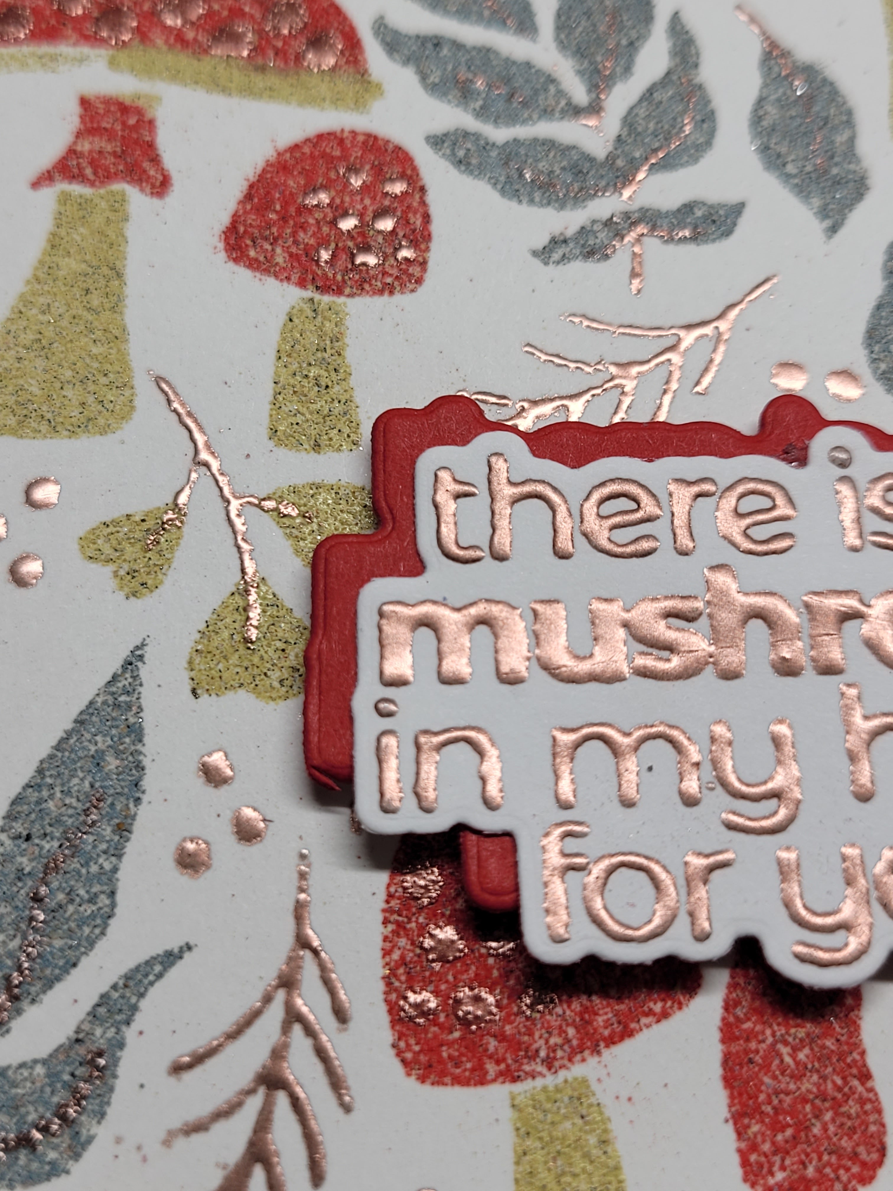
For my next card I wanted to go for a more cheery or optimistic mood.  So I took the large floral stamp and this time I embossed it with Rose Gold embossing powder.  This time I ink blended with the stencils using Altenew Fresh Dye Inks in various yellow and orange tones and just a touch of pink/red for the center of the flowers.  For the leaves, I chose green tones with a touch of aqua.  One I die cut this floral image I took a yellow marker and colored all the edges of the die cut so that it matched the cardstock.  A little bit of ink blending on the base layer and a splattering of Gold Metallic Ink Spray over the florals and the panel finished the card front except for sentiment.  Once again, I used foam tape to adhere the flowers to the panel and create a bit of dimension.


I really love how this turned out.  And I really love using this set with the stencils.  I think you can see in the next picture how using different colors can evoke different feelings or moods.

What are your thoughts? 


Saturday, November 11, 2023

AECP - Impressive Heat Embossing

My latest Altenew Educators Certification Program (AECP) class was on heat embossing.  There were a few techniques which I believe are pretty standard - i.e. use a static free tool - corn starch etc to keep the embossing powder from sticking to places you DON'T want it to be, heat your embossing tool first to make sure it is good and hot (this can help keep your paper from warping) and keep the heat gun moving.  But there were several others that I found intriguing and I will showcase a couple of those techniques here in this blog post.

The first technique was to use a layered stamp set - in this case I decided to use Altenew's Mushroom Garden layered stencil set.  I had several Tim Holtz Distress Embossing Powders in my stash - two that had NEVER been opened (GASP - I am sure I am not the only one who purchased something in several colors and then proceeded to not use them).  Back to the Distress Embossing Powders.  They are designed 

provide a weather look - not necessarily the shiny or glossy look that some other embossing powders provide.  I think the weathered look is perfect for mushrooms - don't you?  I took each stencil and used a domed ink blending foam tool to apply Versamark - a clear embossing ink to the cardstock panel.  For each step in the stencil I used a different color of embossing powder - occasionally using two powders per stencil - i.e. the long skinny mushroom stems I chose Mahogany but the leaves are on the same stencil and I used Weathered Wood.  The final stencil was the detail stencil - dots on the mushrooms, highlights on the mushrooms and veining through the leaves - I chose copper embossing powder - this is the only metallic shiny embossing powder that I used.  For each stencil after applying the Versamark ink I covered the panel with embossing powder - gently tapping the panel to remove excess powder and heat embossing until the powder is melted and set.  Then I moved to the next panel and the next stencil - lather, rinse, repeat.  I think this card turned  out rather rustic but I like it.   
In this close up you can see the weathered or rough look to the embossed images except for the copper.


One hint I have for embossing that wasn't covered is to heat the image from both the front and the back - I find this really helps to cut down on the warping from the heat gun.


For my next card I tried several techniques for the first time.  I just received the Mini Delight Monthly set - Delicate Butterfly, so I decided this would be perfect to try out a few
things. 

The first things I did was to work on the butterfly.  I put my cardstock in a stamp positioner and stamped the layer that would be the most color in Puffy Heart pink and then the same layer in Versamark.  I had a clear sparkly embossing powder that I used for this layer.  For the second layer of shading I used Altenew Rose Gold embossing powder.  For the final layer, the detail layer, I again used Versamark clear embossing ink and then used Black embossing powder.  So this technique involves layering each embossing powder over another color.  I then die cut the butterfly out and set it aside.  I ink blended Puffy Heart and Be Grapeful onto a white panel of cardstock.  Then I took a little bottle of water and sprayed water into my hand and then flicked the water onto the panel.  This caused a reaction to the ink which adds visual interest to the panel.  I then repeated the process but this time I covered the water droplets with the Clear Sparkly Embossing powder and then did it again and added Rose Gold embossing powder.  I had never heard of this technique before and it definitely adds a neat effect to the panel.  The final process was to stamp the flower image in Versamark and use black embossing powder.  Then I took my ink and smooshed it onto my glass mat and used a water brush to watercolor the flower.  The embossing ink acts as a reservoir for the watercolor and contains the ink.  It helps to keep the ink in place instead of bleeding out of the lines.

The final step was to die cut several more of the floral image and then stacking them to make the floral image sturdier and give a little more depth to the card.  For the butterfly, instead of mounting this on foam tape I used my fingers to turn the edges up to add a little movement to the butterfly.

This was a fun class to step up my embossing game.


 This card also uses the November Inspiration Challenge for the colors and so I will be linking it up too.


Wednesday, November 8, 2023

AECP Creative Watercolor Media


Creative Watercolor Media is a Level 2 Course in  AECP and has 3 instructors.  Each instructor gave us ideas on how to watercolor and what medium to use - not just watercolor paints. 

This first card uses my Altenew ink pads as my medium.  I used the ink "smooshing" technique, which involves pressing your ink pad into a glass mat, acrylic sheet or something similar.  One you have your ink pressed onto the surface you can then spritz it with a little water and start painting.  You can slowly build up color, letting the panel dry between layers - depending on how dark you want the images to be.  For this card, I went with a lighter hand to create something a bit softer.  I finished the card off with a simple sentiment stamped on the card and then sprinkled with some iridescent sequins.  I also use a Wink of Stella gel pen for the shimmer in the center of the flowers as well as added to a little water to give a faint shimmer to the background of the panel.


For my second card I used Lindy's Magical Shimmer Powders in the Northern Lights collection as my medium.  It wasn't mentioned in the classes but they did mention using Altenew reinkers or shimmer sprays and I had neither of those on hand.  However, I had seen an Instagram video or two using the above-mentioned powders so I thought I would try it.  
I tapped a small portion of each of 5 powders out on my glass mat and then added a little bit of water to each one in order to activate the colors.  I then used a water brush to start picking up the color and adding to the image.  I chose the Seasonal Blooms stamp set which has this large  image that covers an entire A2 panel.  Very convenient.  (image was stamped in embossing ink and heat embossed with a clear embossing powder.)  When embossing on watercolor paper you do want to try and find a smooth watercolor paper as the usually rough texture will not take the stamped image very well.  I had to stamp this a multitude of times in order to capture the entire image.  Hard to see in these pictures but Lindy's Magical Powders are very shimmery and catch the light nicely.  I only had 5 colors so in order to achieve some shading I would work on an area and then let it dry and come back and add a bit more color or water depending on what I was going for.    These are not normally colors I would go for but I think this turned out so beautiful.
And now for the last card, it again is on watercolor paper. However, for this card I took the leftover paint created by the Lindy's Magical Powders that were spritzed with water on my glass mat and I just started smooshing the paper randomly into the little pools of paint.  The panel it created was a really interesting mix of colors.  I had already stamped the floral images from Lovely Camellias stamp set onto vellum and heat embossed in antique gold.  Then I used one of the techniques from Pretty Posy Mix workshop that was a collaboration between Altenew and Pinkfresh - that technique was to color on the back of the vellum with alcohol markers.  I did my best to match the colors of the Lindy's Magical Powders with my alcohol markers.  
You color on the back of the vellum because the embossing powder will damage your alcohol markers and you can achieve a more blended look of colors.  This card might actually be my favorite of all.  Not my typical colors but man I think it turned out beautifully.  I reached into my "Magic Mug" inspired by Laurel Beard - which is actually just a little container I have where I have pre-foiled and die cut sentiments so I have them on hand whenever I want to quickly create a card.  Finished up with some sequins in my stash that matched pretty closely.

Let me know which one is YOUR favorite.

Get inky today and let me know if you tried any of these techniques.


Tuesday, November 7, 2023

AECP Color Your Day Level 2


It's been a little bit since I have worked on any of my AECP Level 2 courses.  We went on a driving trip through the Northeast to go "Leaf Peeping".  What a beautiful part of the US the northeast is - such amazing views.  After touring the Northeast I headed to North Carolina for a 33.1 Breast Cancer walk over 3 days.  Needless to say I was busy and needed a little bit of a mental break when I got home.  I am finally getting back to things and have a few cards to show you today.

I used the large sunflower image from the Craft Your Life Sunshine Flowers kit.  This large flower covers the entire front of an A2 card panel.  A couple of the tips were use a layering stamp set and let Altenew's color families guide you.  So for this first card I used the stencil that came in the kit for layering my colors and I chose colors in the same color family to add my darker layers.  Once I finished stenciling the flower I used the embossing folder to give it more depth.  Using the accompanying die I cut the flower image out and then layered it onto a panel of cardstock where I had ink blended the same colors.  I then took my Altenew Metallic Watercolor paints and add a few splatters of the bluish metallic watercolor ink that was a close match to the blue-grays I had used in the stenciling. Finally, I added a few splatters of white paint and the sentiment in white as well.


For my next card I used the Altenew November Inspiration Challenge colors as my inspiration for which colors to choose.  The tip for this lesson was to use the challenge or a photo for inspiration and to add a neutral - in this case - I added black for my neutral.

I chose the Altenew Lovely Camellias stamp set for this lesson.  I smooshed my ink cubes into a glass mat and then used the ink to watercolor in my image after embossing the flowers in white on white cardstock.  I then added a little more ink smooshing with a little water and splattered the base level.  Sentiments were also embossed in white but on black cardstock and then die cut before adding foam tape and placing on the panel.  The middle flower was also popped up using foam tape to add a level of depth to the project.

Because I used the November inspiration Challenge I am also going to enter this card into that challenge.  I like to use challenges as a way to get my creative juices flowing - it helps for me to have something to start my creativity - rather than sitting and trying to come up with all parts of a card myself.  Starting with a color or sketch definitely helps me to be more productive and enjoy the process more.  Try it and see if it helps you too.

Let me know what you think about my cards.


Friday, November 3, 2023

Fall Calls for Lattes


Quick post today! This card is for the Coffee Loving Cardmakers Blog Hop
.
 
Supplies used:

Catherine Pooler- Fall Calls for Latte Various Copic markers, white gel pen, sewuins and shimmer spray


Off to follow the hop... Blog hop here


Altenew May Inspiration Challenge

  I recently signed up for an Altenew Dreamy Watercolor class that is being taught by Sarah Simon - The Mint Gardener.  A collaboration betw...