Monday, October 30, 2023

AECP Beyond Basics Backgrounds

Today, I worked on cards for my Level 2 Course - Beyond Basics Backgrounds taught by Lydia Evans.  There were 6 different techniques that were taught.

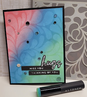
The first card showcases water bleaching.  Very simple but really effective and pretty, I think.  Down below you will see another card that I attempted to do water bleaching on but on that card I used Altenew Fresh Dye ink and the bleaching isn't as obvious.  So, I tried again and this time I used Tim Holtz Distress Oxide inks which are water reactive.  The lesson did encourage trying different inks to see the different effects we would get.  The oxide inks really respond well to the water bleaching technique.

I chose three colors to ink blend on a white cardstock panel.  Then I used the Altenew Flowing Drops stencil for the water bleaching.  I placed the stencil over the top of the ink blended card panel and then spritzed with water.  I let it sit on the panel for a few seconds then blotted with a paper towel.  I checked to see how effective the bleaching was by gently lifting the stencil off a corner of the cardstock.  I wanted to see if I could get a stronger result so I replaced the stencil and spritzed again.

Once, I removed the stencil I got a beautiful result. I used some foam tape to mount this panel onto black cardstock.  Unrelated to this class but a GREAT tip is to take some time to create a bunch of sentiments at one time and keep them on hand.  I used my hot foiling system along with Altenew Essential Sentiments Hot Foil plates and accompanying die set and Sweet Sentiments hot foil plates and diet set and created a lot of sentiments - white foil on black.  I then went through that stash and found the sentiments that I used on this card.  And the last thing I did was drop sequins on the card and glued them where they landed.
    
This card is the one I initially tried to do the water bleaching technique on.  I cropped the picture and you can see in the above picture that the water bleaching is quite subtle.  The card panel was created by taking my ink cubes in Coral Red, Ruby Red and Orange Cream and just dragging them across the cardstock to create the colored stripes.  I use those specific colors in order to follow the Altenew October Inspiration Challenge.  


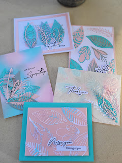
And the panel itself was leftover from creating the below Sending Prayers card for the Beyond Basics Backgrounds class - Lesson 5 or 6 - inlay die cuts.


I used the Stripe Leaf Cover Die and cut it out of white cardstock.  After removing all the little bits I placed the die cut cardstock onto a piece of Altenew Double sided adhesive sheet.  Then I used the Stripe Leaf Cover plate and die cut the previously created striped cardstock.  Once I had the die cut cardstock I took it out of the machine carefully so that I didn't dislodge any of the little pieces.  I aligned the cardstock very carefully over the white die cut cardstock with the adhesive and gently pushed the color pieces into the white cardstock - this created the inlay design.  By using the double-sided adhesive and gently pressing the pieces in I didn't have to do as much fiddly work of placing the pieces individually.  I completed this card by going through my stash and finding DMC embroidery thread that was a color match and some bronze thread and coiled that under the sentiment.  The sentiment is from Versatile Greetings 2 and the layered piece was again colored by dragging an ink cube across it.  I really like how this card turned out.  I love the colors from the challenge and the overall simplicity of the design.


 My final card is also a inlaid design.  This is the first inlaid design that I tried today.  It was an idea I had been kicking around for a while - using inlay with the Edged Wildflower die.

I used glitter/shimmer card stock in blue and pink. I had some navy shimmer pieces leftover from the first time I used the die - I had kept for just such an occasion.  Once I pieced everything together I splattered with a little antique gold spray and added the previously mentioned sentiments from my stash.  The celebrate sentiment is actually the negative of the hot foil technique.  I think this card looks much better in person but it is not my favorite use of the inlay technique.  But I did want to show that not every card is a winner - lol.  Still it is pretty cute.

Let me know what you think.

Saturday, October 28, 2023

AECP - Level 2 Beautiful Details.

The first lesson is this course was about stretching our supplies and using them in perhaps a different way.

To create this card I used the Altenew Coneflower set.  I chose one of the floral layers  - the middle layer and  Dusk Fresh Ink.  This particular method involves second and third generation stamping.  This means that you ink up the stamp, stamp it on a piece of paper and then stamp it again and again to get progressively lighter images.  One thing you can do to help is to "huff" on the stamp.  Huffing is just breathing on the stamp - the moisture from your breath will give a little more life to the ink.  The next step in this process is to use a marker to sketch or doodle more floral details - loosely.  I just happened to have a journaling marker (very fine tip) in a good color match to the Dusk ink.

I chose to create three images in the top right and 2 in the bottom left.  I realized many years ago that having an odd number of images makes the card look more balanced.  An even number makes the card look odd - this is how I taught my students many years ago when I help stamp classes/workshops.  A good way to remember to use an odd number of images.  I also drew some lines along the margins to create a frame.  In addition, I used my marker to add a few dots of varying sizes randomly across the card front. I wanted to add a few more splatter marks so I took the dusk ink and smooshed it on my glass mat, added a few drops of water and then picked it up with a watercolor brush and tapped above the cardstock to splatter.  I did the same thing with Tim Holtz Distress Mica Spray in Aged Pewter for a silver look.  Finally, to finish the card I chose some matching sequins from my stash and dropped them on the cardfront and then adhered.

It was an interesting technique to use but also pretty stressful for me.  I am not really comfortable with just sketching on the card front.  But I am glad that these courses are enabling me to step outside my comfort zone.


The next lesson I wanted to follow was stamping on vellum and then coloring the image. The "beautiful detail" for this card was to add details with colored pencil after stamping and coloring.  The colors I chose for this card were Coral Berry, Ruby Red and Tangerine - in order to follow the Atlenew October Inspiration Color Challenge.

First step was to chose the stamp set - the set I chose was Celebrate Us which was a collaboration between Altenew and Pinkfresh - 2 companies I just love for their products.  I stamped the outline image in Versamark ink and then heat embossed with clear embossing powder.  This helps to create a "no line" colored image. I took my ink cubes and smooshed them on a glass mat then spritzed with a little water.

I used a waterbrush to pick up the ink and color the flowers - to add my details I took a couple of colored pencils in coordinating colors and added some shading and little speckles to the flower centers.  I used a die to cut out the floral images and then did a little ink blending on a linen vellum card panel.  Using the linen vellum softened the brightness of the ink blending.  After the ink blending I took the Antique Gold spray and splattered it onto the panel.  Once the splatter and ink blending was to my liking I fiddled with the floral images to get them layered the way I wanted.  I ended up cutting off a pair of the leaves and layering them in a different place to get the image the way I wanted it.  Lastly, I quickly die cut the word thankful in black and then stamped and heat embossed for you in black.  

Let me know what you think.
 

Tuesday, October 10, 2023

AECP Level 1 Final Challenge - Feminine


For the second part of my Level 1 Challenge I had to make a set of Feminine cards using the same components that I chose for the Masculine set. 

As a reminder I chose to focus on Easy Die Cutting Techniques, Easy Ink Blending Techniques and Let It Shine.

The cohesiveness between the sets is reflected in the same dies and sentiments (font) chosen,  and there are 2 colors in common - the turquoise and silver.  I think this helped to really create a sense that they are 2 separate sets but still could be given together as one gift.
 
If you want more details about how I created these sets please refer to my previous post here:  

I also created a video tutorial on ink blending, embossing with die cuts and faux watercoloring.  You can find that video on my YouTube channel AH Crafts.


The final part of our challenge was to use a recycled element on the cards or as part of the gift packaging.  My recycled element was used for the gift packaging.  
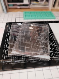
I took these plastic boxes that some stamps sets came in
many, many, MANY - did I say MANY? years ago.  Probably circa 2006 or so.  In addition to the plastic boxes, there is also a sheet of acetate that the stamps came on.  (Hard to see in the photo) - Many moons ago the stamps I bought came on acetate in these boxes and I transferred them to CD cases.  I still had those boxes and acetate in my craft stash.  So I cleaned and scrubbed to get the tape that was left on the boxes off and I used the acetate for a shaker gift tag.

I haven't added a sentiment because I do not know the occasion for the gift yet.  I may not add a sentiment to the front but rather a note on the back of the shaker tag.  

Let me know your thoughts.


AECP - Level 1 Final Challenge - Masculine

I was so excited to finish up my level one courses and receive instructions for my final challenge.  Instructions are to create a 2 gift sets of 4-6 cards - one for Him and one for Her.  In addition to creating 4-6 cards each I need to choose 3 components from any of the 10 classes and there needs to be a cohesive theme between the cards in each set and between the 2 sets.

I chose to focus on elements of the following:

    Easy Die Cutting Techniques

  • Basic Die Cutting
  • Embossing using dies
  • Inlay in the Negative space created by dies

    Easy Ink Blending Techniques

  • Basic Ink Blending
  • Faux Watercoloring

    Let It Shine

  • Glitter Paper
  • Heat Embossing
  • Shimmer Spray
Another challenge that I gave to myself was to try to limit my supplies so for my main supplies I chose the following Altenew products:

  • Leaf Mix Die Set
  • Elegant Sayings - sentiment stamp set with matching dies
  • Blending brushes
  • Fresh Dye/Crisp Dye Ink - Navy, Frayed Leaf, Olove, Sea Glass, Ocean Waves and Artic for the guys
  • Rose Quartz, Pink Diamond and Silver Lake in addition to Sea Glass and Ocean Waves for the girls
  • Metallic watercolor paint and watercolor brush

(Linear Die pictured but ultimately I decided not to use it on this project)

First, I spent a LOT of time die cutting all the leaves for this project - I searched through my stash and found cardstock that matched the ink colors I chose - I also added vellum, linen vellum (far left), Navy glitter and silver glitter cardstocks.

After all the die cutting I continued using elbow grease and started Ink blending 2 panels after checking my sketches to see what ideas I had and what I needed.


Side note:  I planned what I wanted to do first by taking some notes of the colors I wanted to use and sketched out some ideas.
I chose to mask one of the panels in order to create a white frame around the ink blended portion.  A few hints when ink blending - layering - this takes quite a few layers of ink depending on how deep and dark you want the colors to be, start off the paper and then move your wrist in a circular fashion, go back and forth between colors - going back over an area and in between the 2 colors once you have laid down a color.  The more you do this the more the color will smooth out.  And 
 lastly GIVE IT TIME!  Lay your project aside and let the colors smooth out.  When you come back to it you can decide whether or not to add more color.


The next step was to use the leaf dies to emboss a panel of water color paper.  Each die cutting machine has its own sandwich to use to emboss rather than die cut.  You may have to experiment to see what the recipe is for your own die cutting machine.  A hint here is to lightly spritz your paper with water - this helps to emboss without tearing your paper.

After I embossed the watercolor paper I took my inks cubes and smooshed them into my glass mat to lay down some ink.  You can do this on a glass surface, on acetate, plastic - any non porous surface.  Then I lightly spritzed water on the ink and used a water brush to pick up the ink and start watercoloring the embossed image.  This is the Faux Watercoloring technique I mentioned above.
Once I had watercolored the embossed panel I used the leftover ink on my glass mat and swiped or tapped the linen vellum die cut leaves in that ink.  This also provided a watercolored look to the die cuts.  I did add a bit of the whitish metallic paint from the Altenew Metallic watercolor set - this color seems to be between silver and white so it worked well to add a bit of silver shine to the die cuts and water colored panel.

Once I had this done it was time to start assembling my cards.  A great hint for assembling a LOT of die cuts is to lay them out on your cards in the manner that you want them to be on your card - then use a piece of low-tack masking tape or Press-N-Seal to place over the top of your layer of die cuts.  This will keep them together enough for you to add some glue and place them back onto the cardstock.

Lastly I placed the dies all over a panel of white cardstock and ran it through my die cutter.  Once I had removed all the dies from this panel I then created an inlay design by filling those negative spaces with the colored die cuts and filled the various negative spaces with the little fiddly pieces that came out of each color when I had initially die cut each color of leaves.

This particular technique can take quite a bit of time and patience but I just LOVE the outcome.

Ultimately, I created 5 cards.  

What do you think about these cards?  I really love how they turned out.  The colors are so vibrant and fun.


My next post will showcase the cards for her that I made, a video tutorial and the gift packaging which was made from some recycled items I found in my stash.

Let me know what you think!


Saturday, October 7, 2023

Pinkfresh Studio - Smile

I had fun creating this card today for World Card Making Day.  

I used Pinkfresh Studio Quadrant Die and Stencils as well as the Foliage Shaker Dies and a sentiment from Thanks for Being There stamp set.

I used cardstock I had on hand that matched as closely as I could to the color challenge.  Same with my inks  - I tried to create a bit of an ombre effect with the inks and stencils.  And for the extra touch of fun I created shakers with the Foliage Shaker Dies.  So cute!  

This card works for the Pinkfresh Studio Color Challenge, Simon Says Wednesday Challenge - Pinkfresh and Stencils and Pinkfresh Studio Anything Goes - World Card-Making Challenge.  


Tuesday, October 3, 2023

Inky Paws Challenge #208 - Halloween

This fun card is my entry into Newton's Nook Inky Paws Challenge #208.  The theme this week is Halloween.

I decided I wanted to do something a little unexpected and use the Pumpkin Latte stamp set again.  I also had the Spiderweb Stencil that I have been wanting to use.

I did a bit of ink blending on white cardstock before I blended black ink over the stencil.  Then with the stencil still in place I use a bit of Distress Spray over the top.  To tame the bright colors down a bit I added a bit of vellum.  

I did a bit of masking both to the main image so that there were pumpkins at her feet and then to get the pumpkins out of her arms and into the corner.  In addition, I used a little marker on the jack-o-latern in the Candy Corn Newton stamp set in order to add a little face to two of the pumpkins.    And I used Trick or Treat from the same set and added at the feet of my lovely Pumpkin Latte lady.


 This is more the type of Halloween that I enjoy - a latte and lots of pumpkins with some fun colors.

I hope you like this card as much as I do.

Let me know what you think.

Sunday, October 1, 2023

2nd entry - Simon Says Stamps - Monday Challenge - Christmas


 For my second entry into the challenge and my 2nd Christmas card of the season I again used Sweet & Sassy's Vintage Holly stamp set.  This time I heat embossed the leaves, berries and branch in gold as well as the Merry Christmas sentiment.

To finish the card I ink blended the card with greens and reds after using the text and postmark in a light brown color for the background.  Two down and many more to go.

Enjoy.

Simon Says Stamps - Monday Challenge - Christmas

First Christmas card of the season and all thanks to Simon Says Stamps Challenge.

I used Sweet and Sassy Stamps Vintage Holly stamp set.  I die cut the piece prior to stamping the leaves and berries.  The first time I stamped everything but didn't place the leaves and berries in the right place in order to die cut - lesson learned.

Used the text stamp and postmark stamp on the background and then ink blended over the top.

Finished by adding Merry Christmas to the top of the panel.

Hope you like it! 


Altenew May Inspiration Challenge

  I recently signed up for an Altenew Dreamy Watercolor class that is being taught by Sarah Simon - The Mint Gardener.  A collaboration betw...